LastGraph
Make graphs of your last.fm listening history at LastGraph.
This is from my profile data:
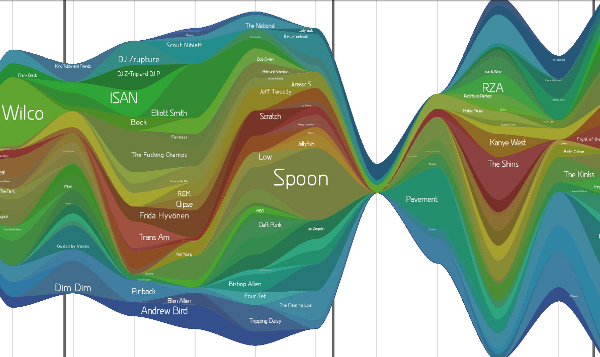
Get the detailed PDF from which the above was captured (it’s so pretty).
Wordle
Wordle is a fun tool for making what I will call “nice-looking tag clouds”. It’s like tag-tinted glasses for the written world.
Here are two I made today.
LaTeX – from the first few paragraphs of the Wikipedia entry on LaTeX

My del.icio.us tags – from my del.icio.us

These are super-customizable but I can’t let myself play with it that long. (That’s what she said.)
I am very busy finishing my thesis; the plan now is to finish and move out of Cambridge at the end of July. I will come back to blogging, hopefully daily again, at that point. I miss it quite a bit. So stay tuned…
The Mathematics in Music
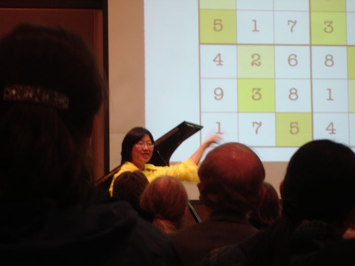
I went to a very interesting performance today: “The Mathematics in Music: a concert-conversation with Elaine Chew”, in Killian Hall at MIT. Elaine is visiting Harvard for the year from USC, where she is a professor. She has an amazingly broad background that is super-pleasing… having studied math, computer science, music performance, and operations research.
Elaine performed four piano pieces, three of which were composed just for her, that use playful tricks in math as compositional inspiration. Some of these tricks included:
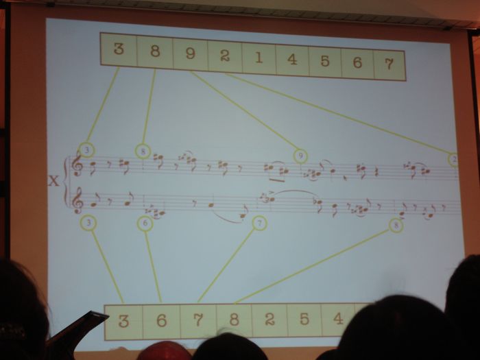
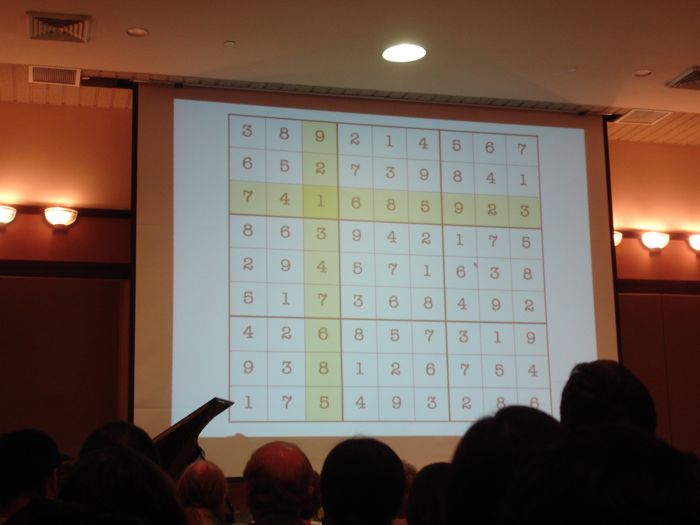
- Composing with a meter determined by the numbers in a row (or column) of a completed Sudoku puzzle. This piece had a different time signature for every measure… 3/8, 1/8, 7/8, 9/8, and so on, accompanied by an entirely different sequence for the other hand. I was very impressed that anyone could play a piece like that. Listening in the audience, you want desperately to tap your foot to ground yourself in some kind of beat, but it’s impossible.
- A bi-tonal piece: right hand and left play in different keys. Chew likened this to patting your head and rubbing your belly at the same time.
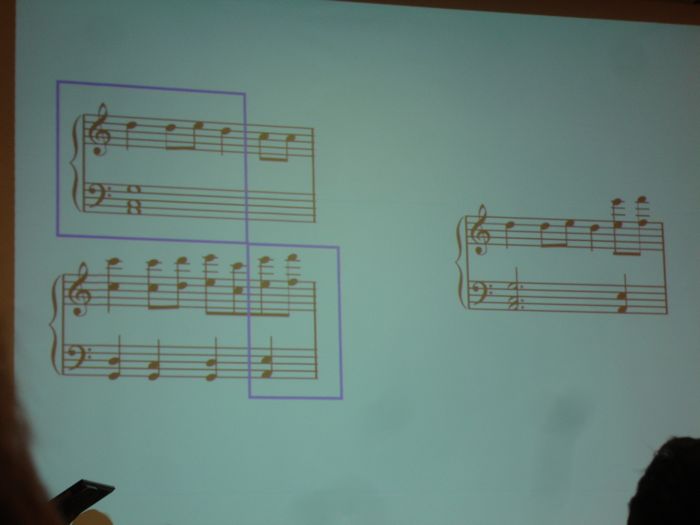
- Genetic programming: The composer applies the idea of genetic mutations and substitutions on a familiar theme at the note and phrase level, which results in some jarring effects.
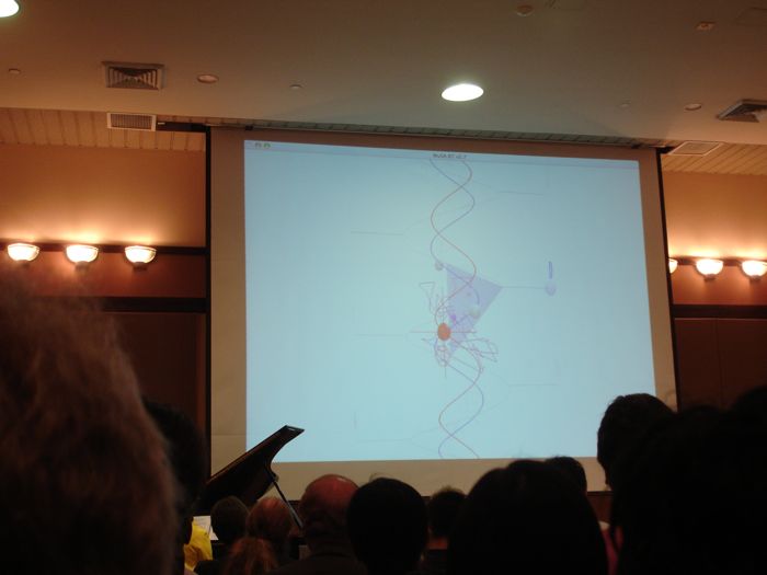
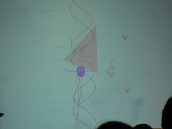
Elaine and her colleague, Alexandre Francois, developed a way of visualizing tonality called MuSA.RT, which accompanied her during two of the pieces. MuSA.RT shows (as a real-time accompaniment to MIDI-enabled piano) the changing notes and key of the piece along a spiral that is kind of like a 3-D version of the Tonnetz. More on the model in Elaine’s paper (PDF).
Where the yin yang symbol comes from
 Wow, this page has a description of where the yin yang symbol comes from. It claims that the symbol is actually a graph of the length of the shortest shadow observed each day throughout one year. It’s a simple spiral.
(Apologies for linking to pages with pop-up ad windows!)
Graphicacy
graph·i·ca·cy [ gráffikəssee ]
noun
understanding of symbols and diagrams: the ability to use and understand such things as symbols, diagrams, plans, and maps
[Mid-20th century. <graphic , after literacy]
More on Wikipedia. Also: graphicacy in education.
How have I gone so long without this word?
Martin Wattenberg’s advice to me
Tonight I went to see Martin Wattenberg (from IBM’s Visual Communication Lab) talk about visualizing the patterns in Wikipedia edit histories (see history flow and chromogram). It was very fun, very interesting, and makes me think it’s possible to have a job that feels like play.
Afterwards I asked Martin if he had any advice for me, as I’m about to embark on my Masters thesis work, which is really just a big visualization project devoted to looking at people’s music collections. I was wondering what kinds of coding tools he’d recommend. (All of his Wikipedia visualizations were built in Java.) He said, “You’ve got one big question to answer first… Do you want to put this on the web, or not?” If I want it on the web, he says, go Flash; if not, try Processing. And he strongly suggested making it for the web, because that creates the possibility for an instant community and lets the project take on a life of its own.
Thursday, November 15, 7-9 pm
Visualizing Wikipedia: A tale of life, love, and bureaucracy
Martin Wattenberg and Fernanda Viegas (in spirit) , IBM Visual Communication Lab
Abstract: We report on Wikipedia’s evolution from a curiosity to a point of first
reference for millions. Applying data visualization techniques to
Wikipedia’s historical archives uncovers a story in three acts: life, love,
and bureaucracy. “Life” refers to the impressive ability of Wikipedia to
heal itself after vandalism and errors. “Love” is reflected in the
overwhelming scale of individual production and the passion shown by devoted
editors. And bureaucracy–an unexpected aspect of a free-spirited
community–is becoming prevalent as the site scales, with emerging
formalized processes and roles that help ensure quality.
“Visual Music” lecture
I gave my first lecture today. It was a 2.5-hour class on visualizing music, part of the Musical Aesthetics & Media Technology class I am TA-ing.
I spent much of the last few days preparing for this, and I found some impressive examples of visualizing music from the past few hundred years. In fact, there were so many examples that one of the hardest parts of preparing for the talk was defining its scope. I chose the examples I thought were most relevant to telling my version of the story, including Klee, Kandinsky, Oskar Fischinger, the Whitney brothers, Fantasia, all the way up to Ratatouille, the Music Animation Machine, and Martin Wattenberg’s The Shape of Sound. You can see all of these here, in my presentation:
Click image above to download interactive QuickTime slideshow (4.2 MB)
Underlined texts are link-outs, and you can use arrows to navigate through the show.
My favorite example of all is Oskar Fischinger’s Allegretto, which blew me away. Unfortunately I can’t find this online, but there is a fantastic DVD with that video available here.

(Tomorrow or Friday I will follow up with a set of links that cover the best examples of visual music that I found, including a couple of killer blog finds. That set will be much larger than what I was able to cover in class today.)
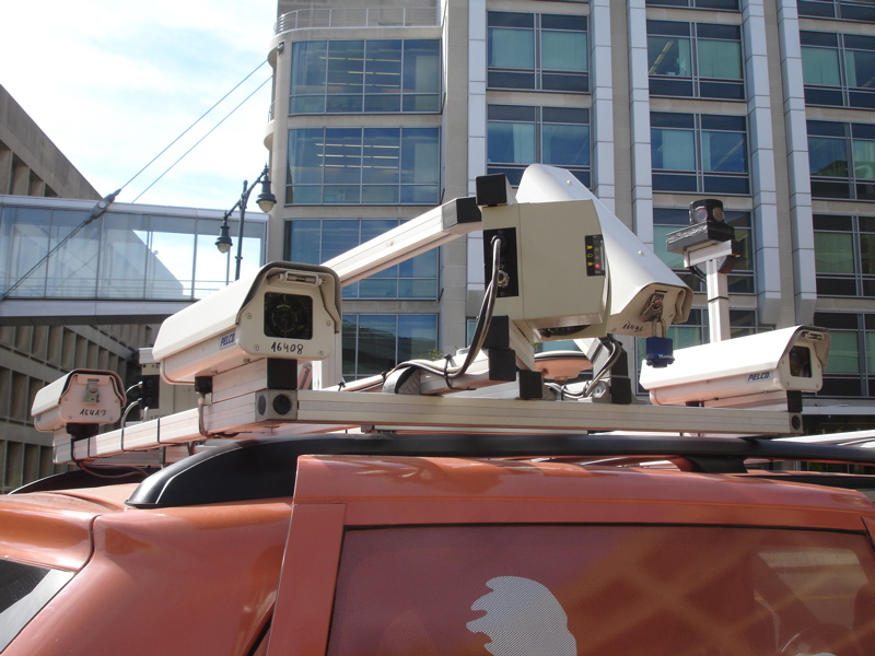
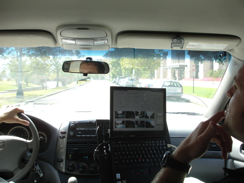
Mapping your world
 Tele Atlas held a workshop at the Media Lab today, and I got to go on a ride in one of their “mobile mapping vans”. They drive up and down the streets of major cities and highways in this van, which is equipped with several cameras and laser range-finders on the roof, with a GPS receiver and a rack of memory on the inside. Tele Atlas uses the imagery and distance data to help enhance and texture their new 3D maps, which nicely represent the shapes and appearance of the buildings along the streets.
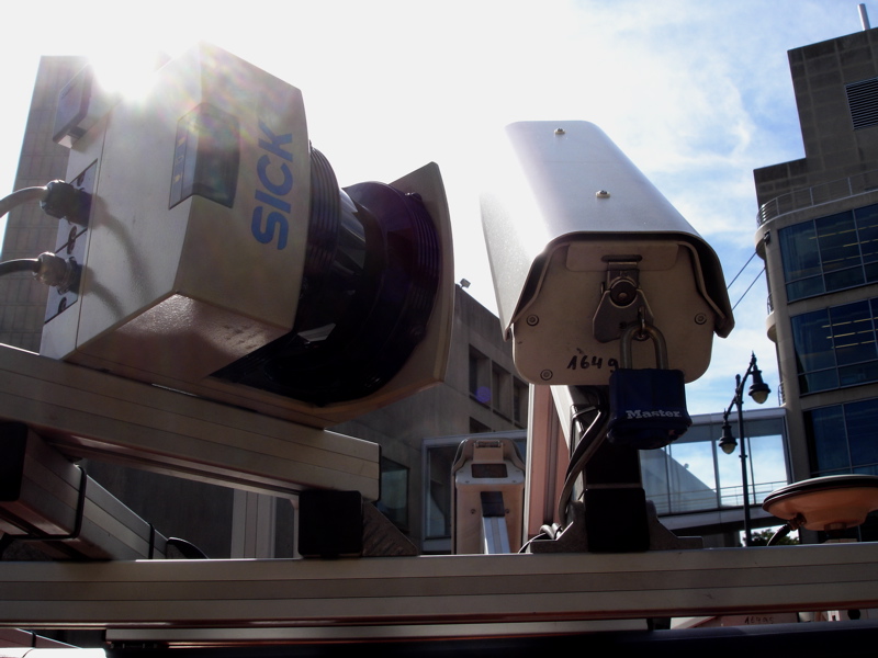
I climbed in next to the rack, in the only back seat, while my two friendly mapper-driver-dudes took me on a 5-minute ride around MIT, so that I could see the cameras in action. They have cameras on the roof, pointing to either side of the van, and two angled up at about 45º to get snapshots of taller buildings. They also have a “spherical” camera called a Ladybug, which has five cameras arranged in a ring, in a red housing. On either side of the roof are laser range-finders that map out the building layouts and shape as viewed from the road. (I love that the laser manufacturer is named SICK, and that they display this proudly on their devices.)
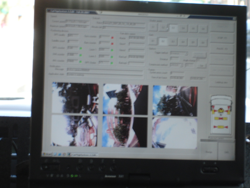
The guy in the passenger seat looks at maps and camera feeds on a pole-mounted laptop next to the seat, adjusting apertures and directing the driver to roads they have not yet covered. He’ll also mark a road if it’s under construction or one-way.
It seems slow-going; the van can’t take measurements if it travels above 33 mph. This guy’s been working with his partner to map Boston and Cambridge since the beginning of August. They’ll finish in the next week or two, and then move on to another city. I asked him how long it takes to map an area, and he tells me, “It depends on the traffic… Yesterday it was really bad in the Back Bay and Brookline, so we only covered about 75 kilometers in 6 hours.” On a good day, his best, they covered 170 km (106 mi).
Let the geo-nerditry commence!
How much do I move when I sleep?
For my final project for sensors class, I wore accelerometers on my head, arm, and leg for a full night’s sleep, and tried to track how much I moved during the night, and which positions I tend to sleep in.
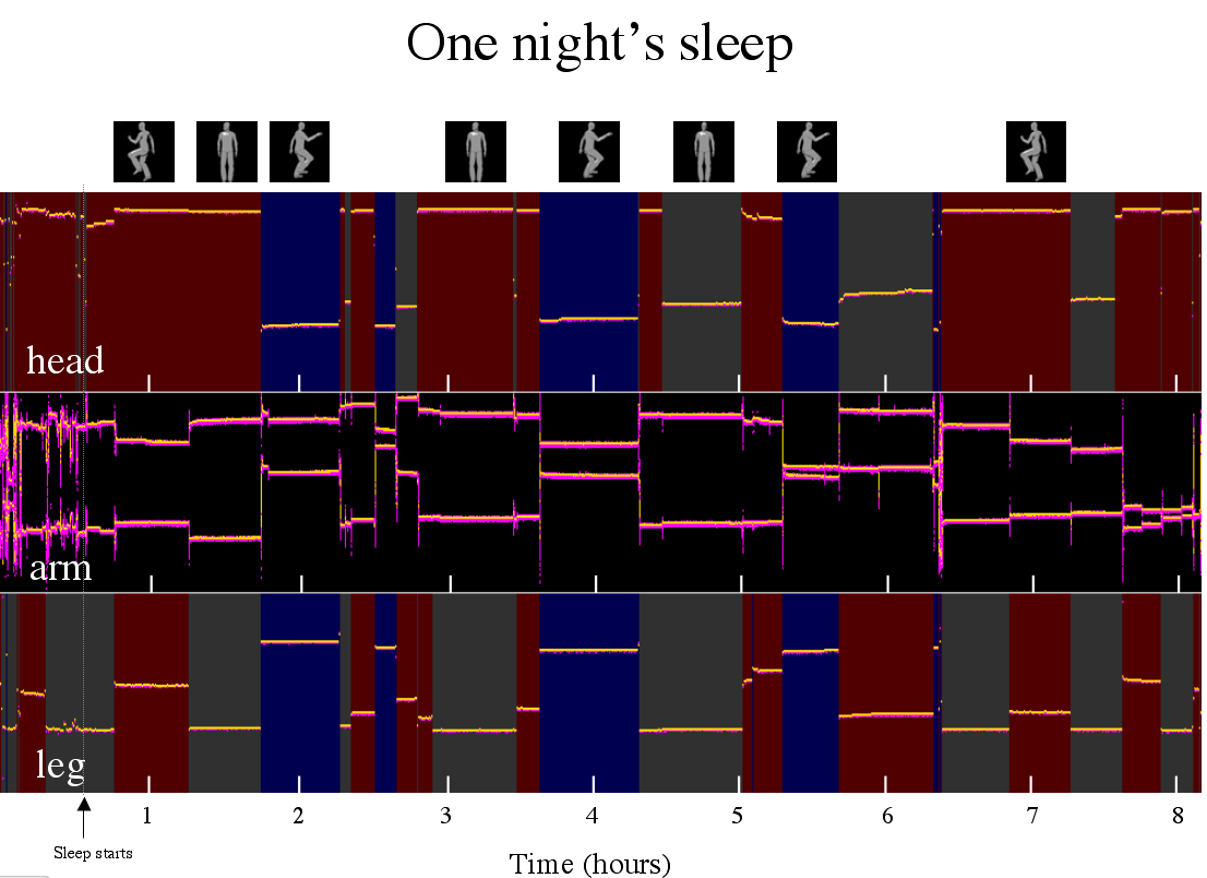
Main findings:
- I’m a side sleeper.
- I like staying in one position for about 40 minutes at a time.
- That period of time gets shorter as I sleep longer.
I wrote up some quick notes about the project here.
Spirals, scoops, sailing
Today was awesome.
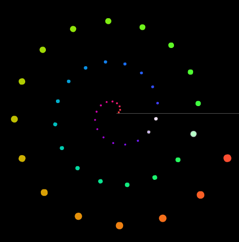 I met a fun guy named Ned Gulley, who works at Mathworks. He showed me this great thing: Fermat’s spiral. He introduced me to the spiral by pointing out that KrazyDad did some amazing musical visualizations using this pattern. You definitely should look at these two in particular, to see the pattern at work:
- Whitney Music Box
(This reminds me of the Electroplankton Nintendo DS game.) - Fibonacci Logos screensaver from this post: “The motion in this screensaver is actually quite simple — if you look at each disc, you’ll see that it is just sitting in place, rotating at a constant rate. However, each disc spins slightly faster than the next largest one, which produces a series of very interesting patterns over about a 10 minute cycle.”
Very cool. Thank you, Ned!
- Whitney Music Box
- After dinner with my group, we went to one of the most comfy places in Cambridge, Toscanini’s ice cream, and I got the best flavor: ginger snap molasses. I asked my favorite ice cream guy how many scoops of ice cream is in each one of those big tubs. He said, “Well, I’m not totally sure… but… there are usually about three gallons of ice cream in each one… and each scoop is 6 ounces. ‘2 scoops’ is 8-10 ounces.”
First off, “2 scoops” ain’t 2 scoops! Who knew. (…although “2 scoops” doesn’t cost twice as much either, so I’m not complaining.)
I told him I would figure out how many scoops were in a tub and let him know. After some argument at the table over how many cups/ounces/monkeys are in how many gallons, we decided that the answer is about 75 scoops. (128 oz. x 3 gallons / 5 oz. = 75. ish.)
- Sailing and learning to sail at MIT are FREE! I hope to try it out this summer.
